DegreeChamp
Mission: Design a custom degree planner application that increases on-time college graduation rates.
Introduction
DegreeChamp (formerly known as RamifAI) is an automated degree-planning software designed to create a personalized degree plan for college students. The goal is to prevent students from being forced to delay their graduation due to poor planning caused by unclear requirements and inconsistent class schedules and sizes.
I joined the DegreeChamp team when it was a start-up with UT Dallas’s UT Design program. For a semester, I worked alongside fellow UX/UI designer Marcus Gonzalez and the start-up owner James Griffin to design the first iteration of DegreeChamp. This was my first “real-world” project, and I gained a lot of experience on managing a project and communicating with product owners and development teams.
Objective #1
Research the effect of the current state of degree planning on students and advisors.
Personal Experience
As a student myself at the time of this project, I had a pretty good idea about the stresses myself and my friends faced about planning degree pathways. What was the quickest way for me to graduate? Is this class only available in the spring? Have I met all the requirements I need to take this course? How quickly do I need to refresh my browser so I can sign up for my courses before everyone else in my time slot?
I also knew the horror stories of students who were forced to graduate late because they didn’t realize a course was only offered once a year, or they forgot about a minor requirement unrelated to their major, or the one class they needed filled up before they even had the chance to sign-up. College is expensive and exhausting – it shouldn’t be this hard to find the best way through.
Student Interviews
To confirm and expand our understanding of registration and graduation struggles, my teammate, Marcus Gonzalez, and I reached out to 12 students from a variety of majors and classifications. We asked them questions such as:
- How far in advance do you plan your classes?
- Did you create a four-year plan? Was it useful to you?
- Have you faced any struggles when registering for classes?
Advisor Interviews
Students weren’t our only focus – we also needed to understand the needs and perspective of advisors. We talked with the Engineering & Computer Science (ECS) advising department at UT Dallas next. To start, we interviewed 2 advisors individually, asking questions like:
- What are your specific job tasks?
- What are the ideal outcomes you desire from a meeting with students?
- What are your methodologies?
- What common questions do students ask you?
- What common problems do you face?
Once we had a solid prototype of a student view, we met with the entire ECS advising team to evaluate our work. Although our main intent was to gather specific feedback on our prototype, what ended up happening was a high-energy brainstorming fest for potential features. The atmosphere in the room was electric – the advisors, pumped about this new software that could radically improve their workflow, started rapidly bouncing ideas off of each other. I learned more about the advising team’s culture, workflow, and needs in 30 minutes than I did with weeks of previous research. I left the meeting with tons of new feature ideas and a significant market opportunity for my team.
Insights
The research results, combined with our own experience as students, provided us valuable insights. The more I learned about the college degree ecosystem, the more I realized advisors were the key beneficiaries of this software. A single advisor can oversee hundreds of students. They are the ones capable of making the biggest impact, so a software optimized to their needs will consequently bolster their success.
In respect to the start-up company, I’m unable to publicly share the specific insights I found while performing research for the company. If you’d like to know more about the research process, please reach out to me.
Objective #2
Define a feature list that incorporates user insights.
Using our research, we distilled our customer needs into a feature list that described all of the functionality that should be included in the web app. Based on our research, we expected to have 3 separate views for each of our user groups: students, advisors, and administrators. During my time with the project, we focused first on creating a feature list for student and advisor views.
I've documented some key features for each view. I'm unable to describe the specific user insights that informed each of these features in respect to the comapny, but I do make sure that each of these features meet a user or business need.
Student View Key Features
- View their current degree trajectory based on their chosen major and course history
- View their expected graduation date
- View recommended class schedules for all future semesters
- Adjust their curated degree plan as needed
- Import credits gathered from other institutions
Advisor View Key Features
- Search for individual students
- View a student's expected course plan
- Suggest edits to a student's course plan
- Document meetings with students
- View a student's audit
- Store relevant documents
- Batch students into lists based on certain filters
Objective #3
Design the user interface for students and advisors.
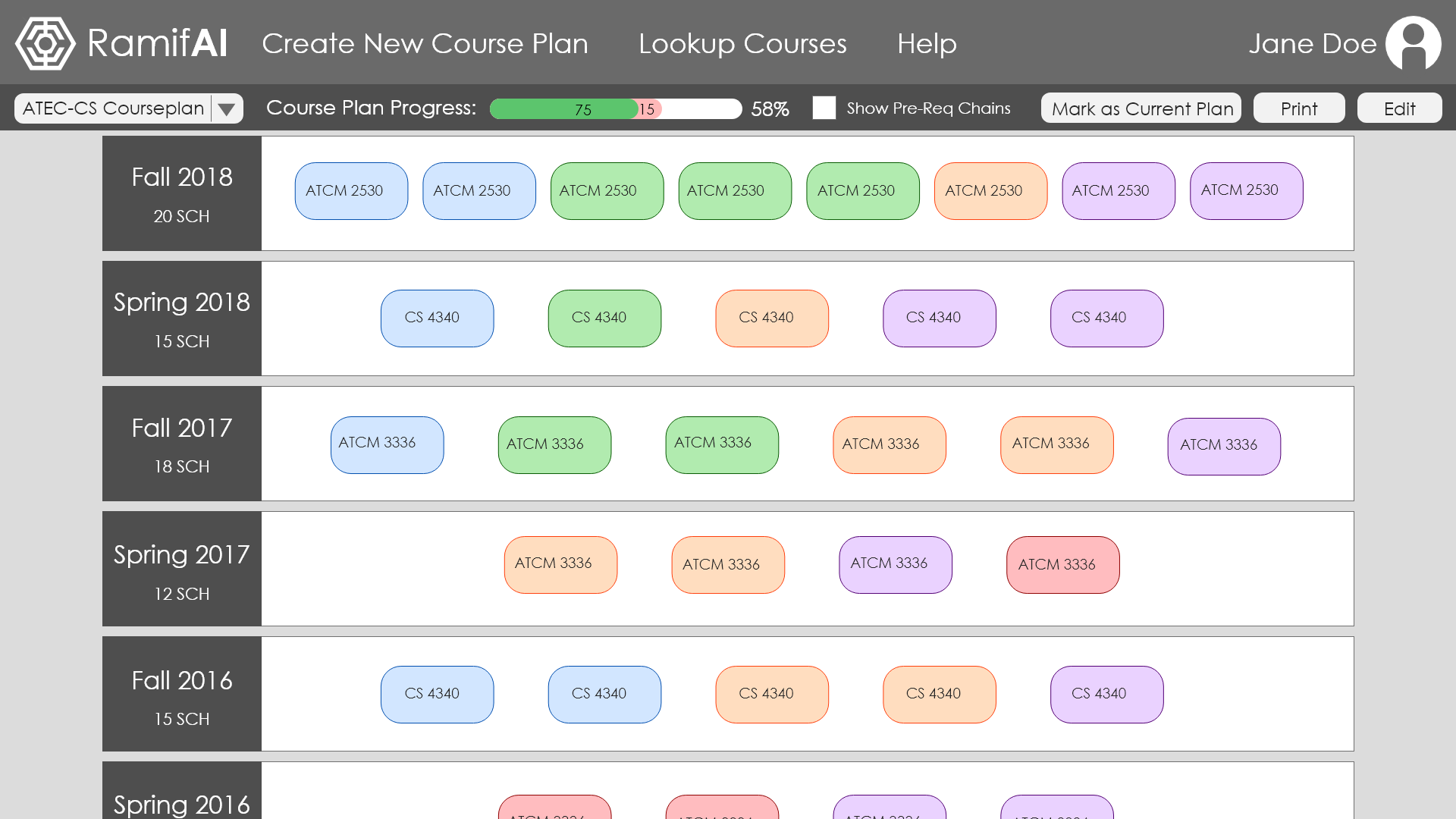
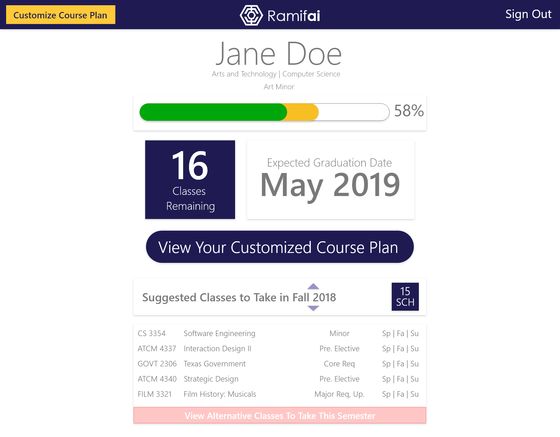
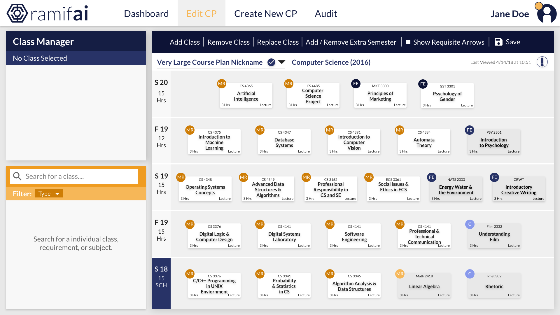
We started by creating low-resolution, low-fidelity wireframes. There were three core screens in the student view: 'Homepage', 'Create Courseplan', and 'Edit Courseplan'. Initially, we expected a lot of students to not care enough to go beyond the homepage, so our original thought was to place as much important information as possible on the opening screen.
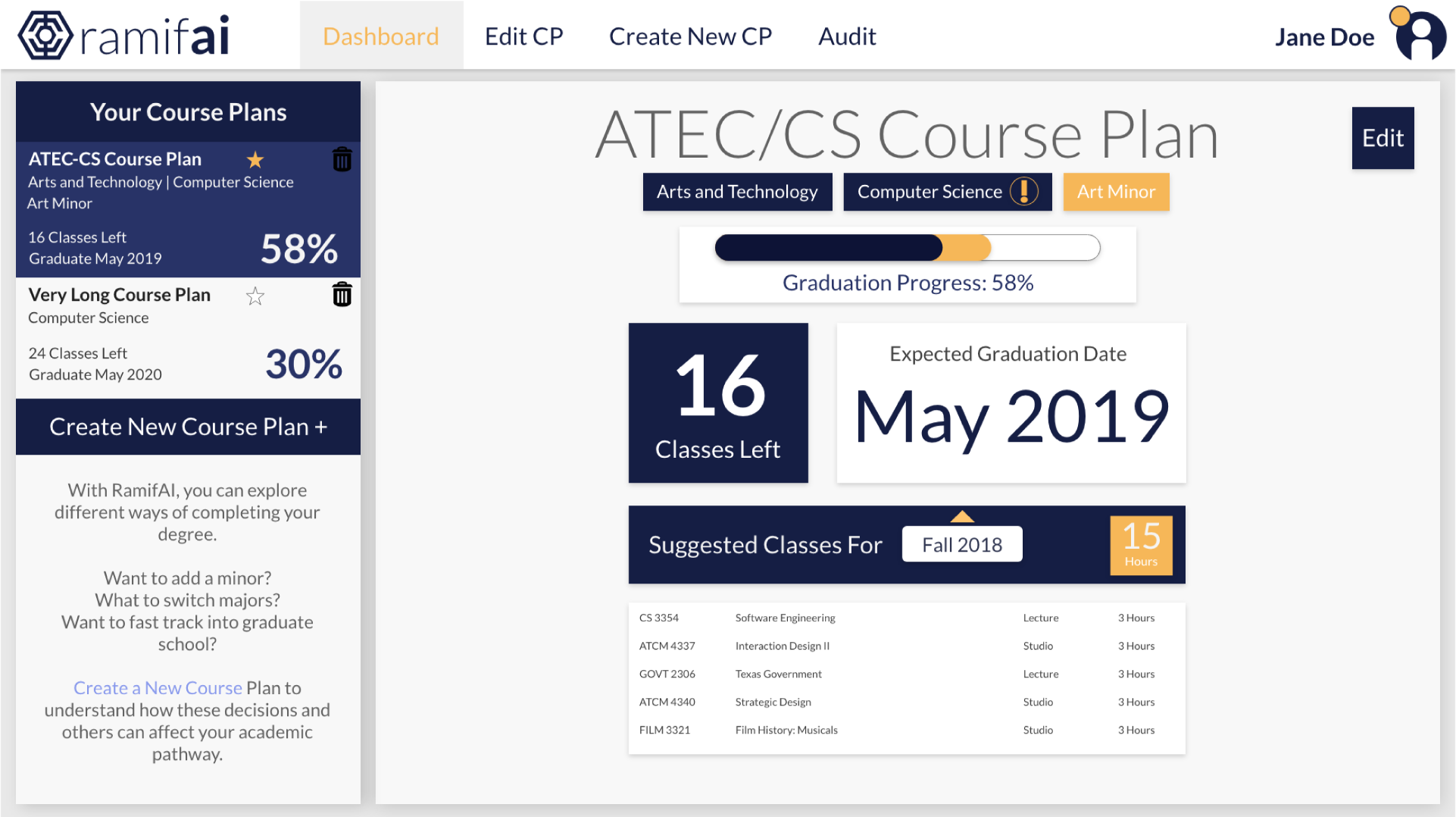
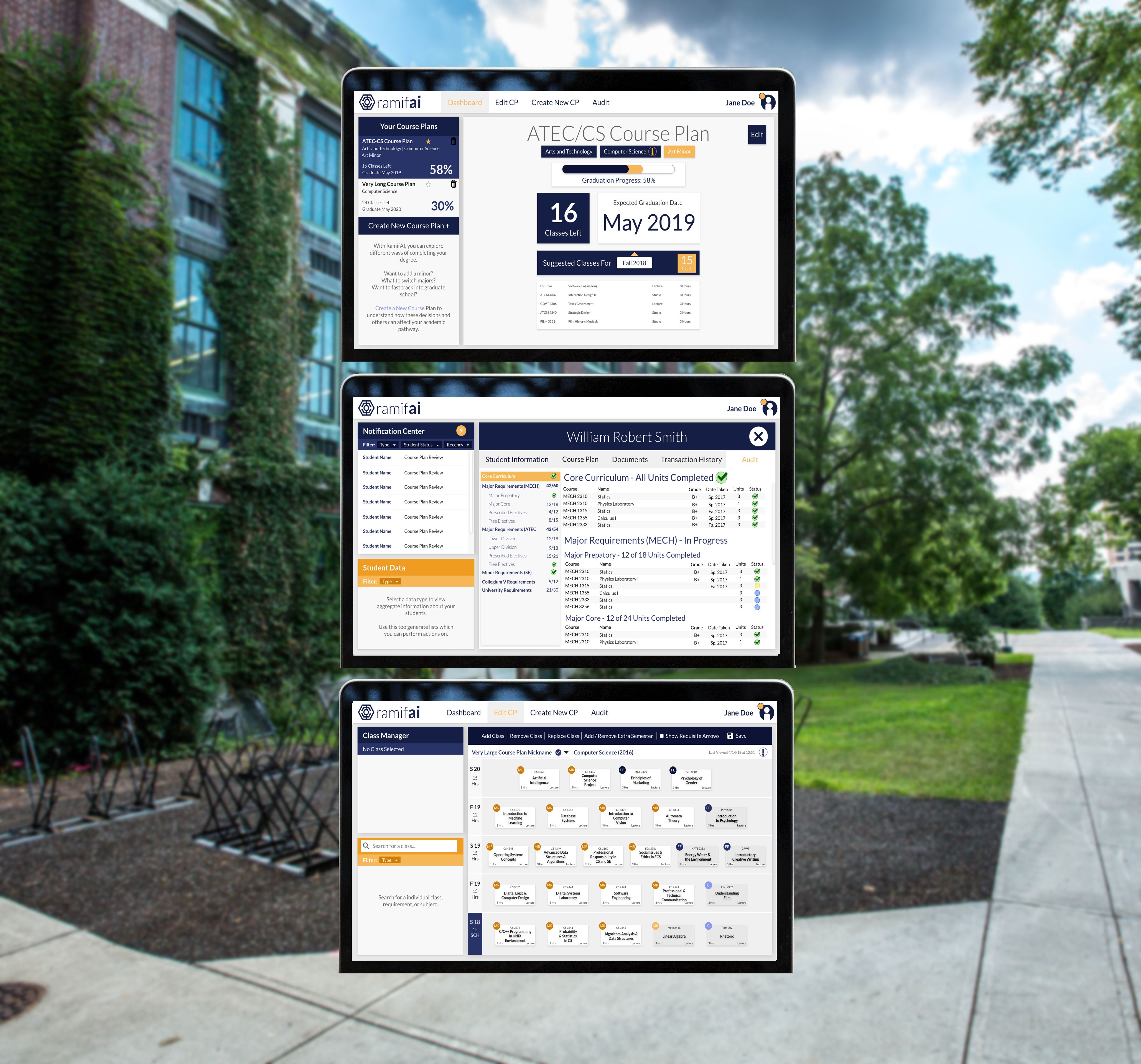
However, this version is too crowded and overwhelming for a homepage. It doesn't convey what's truly important to students which is 1) when can they graduate, 2) what classes do they need to take next semester, and 3) are there any problems they need to fix. With this in mind, we revamped the homepage to be a dashboard that streamlined information into meaningful, quick chunks.
My partner Marcus designed the 'Edit Course Plan' page, while I worked on the homepage. Each week we'd present our work to the development team to get feedback. We iterated our screens several times before finally settling on these versions.
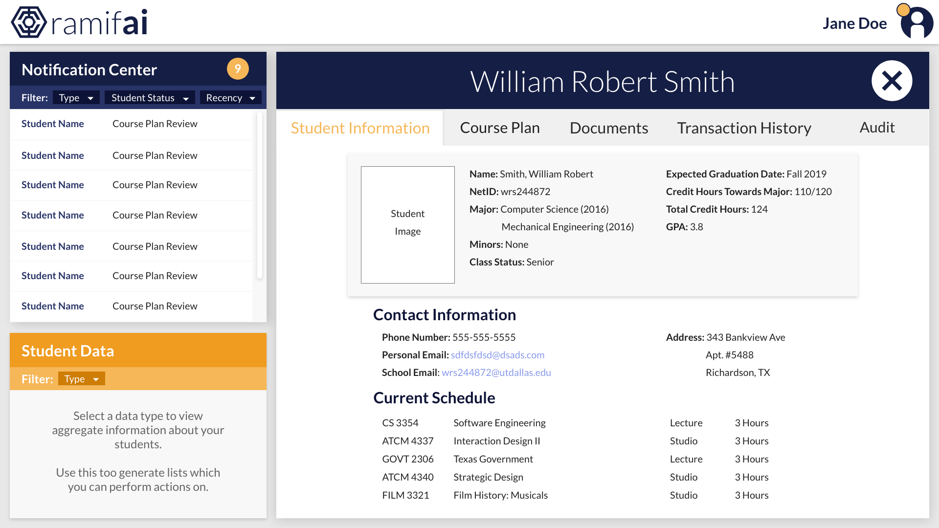
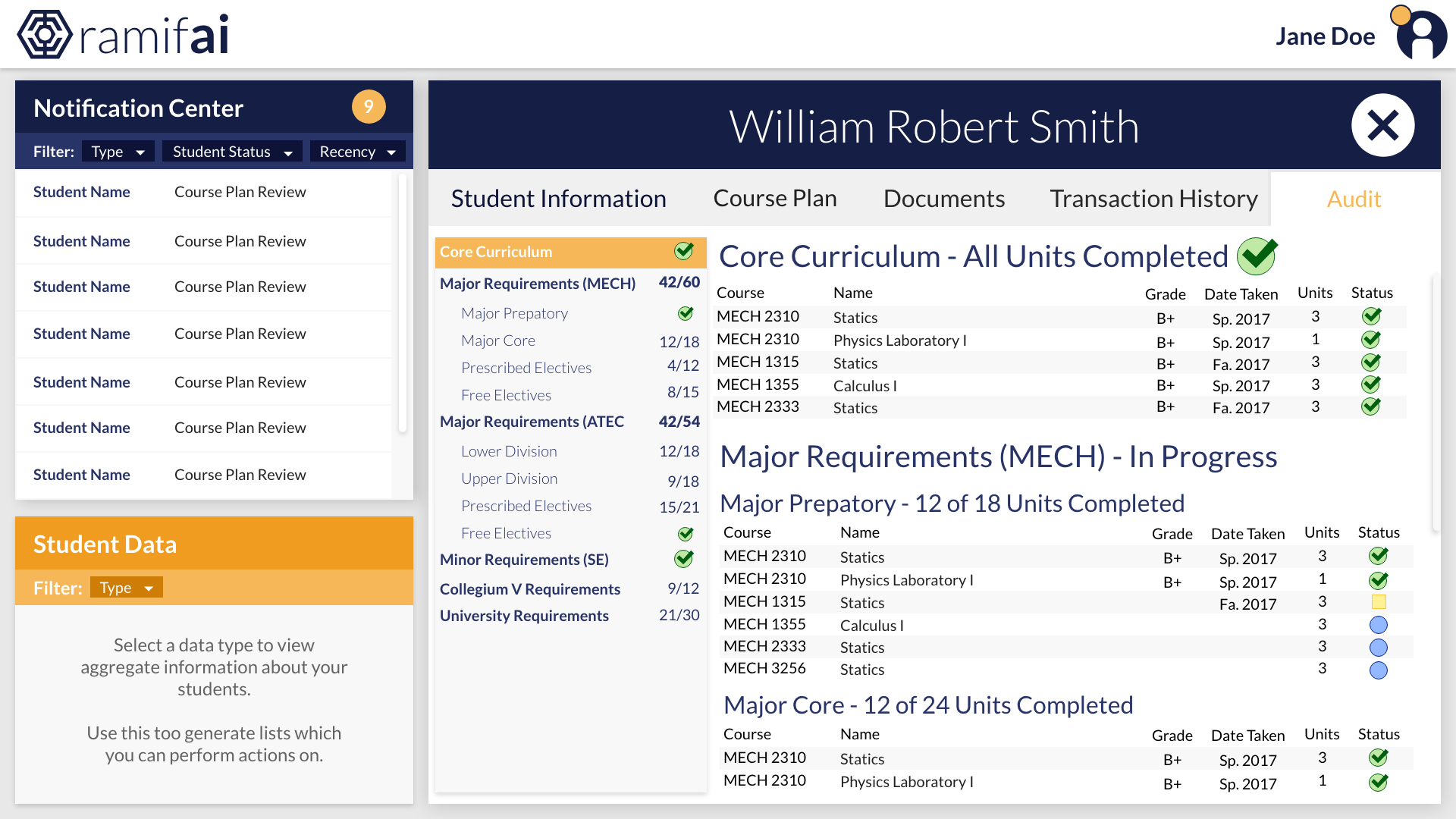
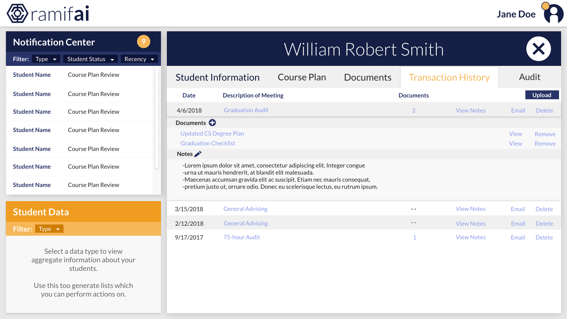
About 10 weeks into the semester, we started designing the advisor interface. The development team could only complete one view by the end of the semester, but our work could be used for future dev teams. You can view some of my favorite interfaces I designed below.
Reflection
DegreeChamp was my first shot at doing real UX work for a real audience. The project owner, James Griffin, had a great idea to solving a lot of the issues students faced, and I was thrilled to support his mission. I truly wished I had something like this when I was going through college. It would have satisified my need to overplan everything about college.
But I wasn't just designing this software for me. I had to consider all of the users this product would affect.
I was pleased with the user research my partner and I did for this project. I learned about the struggles my fellow students faced, as well as sections of students who this product would not benefit at all. I also learned about the many obstacles advisors faced, and how by solving their issues would solve a lot of students' issues. As with many projects, there was a lot more research I wish I could have done, including contextual interviews and wireframe testing. However, I'm glad I got the chance to gather the insights we did.
I was also very pleased with our final UI design. Marcus had a strong role in defining the visual design of the project, and I was able to bounce off his work to incorporate the user insights we gathered into the UI, such as in the creation of the dashboard.
One of the things I wish I could've done during my time with DegreeChamp is user-testing. We created a solid design in our team's perspective, but we never got to verify this with actual users.
All in all, I consider DegreeChamp to be a great first project for me to apply my UX education.
