Apex Catalyst Group
Mission: Design and develop the new visual identity and website for the business development company.
Introduction
2019 was the year of massive internal change for Sandi Mitchell’s business management firm, and she wanted her brand to accurately reflect this new stage of her company. She had the name – Apex Catalyst Group. Now she needed a new logo, a cohesive brand style, and a client-facing website.
Over 7 months, I worked with Sandi to develop a logo, website, and branding materials that matched her positivity, bright personality, and contagious enthusiasm for growth. Sandi spends her days helping others discover their inner superhero – I wanted to make sure her brand properly showcased her own incredible superpowers.
Objective #1
Design a logo that encompasses the company’s professionalism and bright, positive personality.
Understanding Sandi and ACG
At our Design Kick-Off, I asked Sandi what she believed made her company unique.
She talked a lot about the countless obstacles and responsibilities that business leaders must address and how overwhelming that can be to navigate. With an experienced guide by their side, a leader can synthesize all of the chaos into clarity.
But for Sandi, it’s not just about helping leaders understand what they need to do. It’s about empowering individuals to become the leaders they’ve always wanted to be. She identifies and celebrates each of her client’s superpowers. Her team brings positivity and inspires confidence with every meeting. She offers a powerful, uplifting mix of emotional intelligence and analytical prowess to the businesses she works with. It’s her passion to watch those that she’s helped follow their pathway to success.
As Sandi told me all of this, I identified her company’s key values that I wanted to evoke with this rebrand: Confidence, Positivity, Connection, Individual Achievement, and Accelerated Growth.
Sketching Ideas
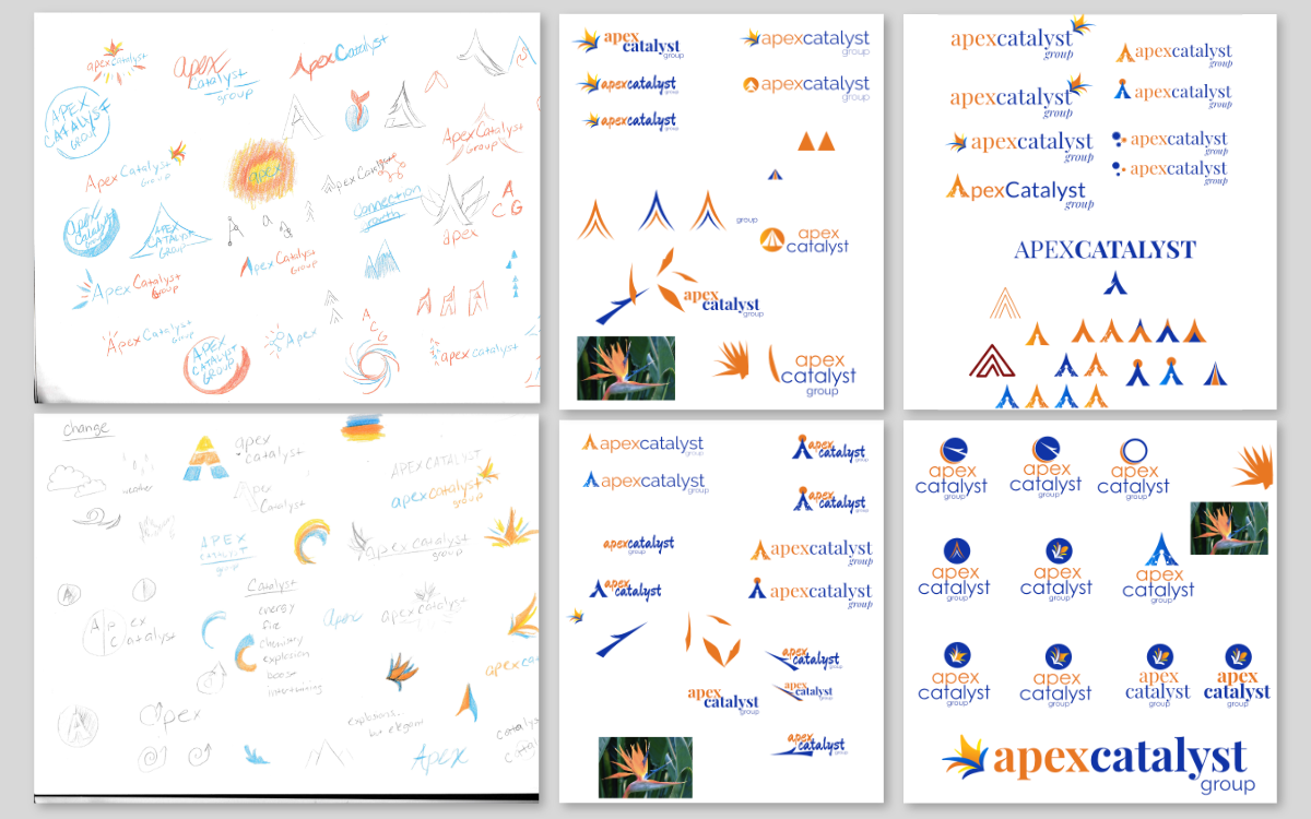
Now that I had a stronger feel for Sandi and her company, I started sketching potential ideas for the logo. Logo ideas didn’t come easily to me this time, but where inspiration fails me, iteration and research gets me further down the road. I explored popular logo layouts, researched symbols that represent ACG’s company values, and played with different font and color combinations. I filled several pages with sketches and concepts.
From my hodgepodge of ideas, I selected my best three concepts and refined them into full-color logos, then presented the logo concepts to Sandi to see which elements, if any, resonated with her.
The first one resonated the best. We took this version for feedback and into the second round for design improvements.
Finalizing the Logo
Initial feedback on the logo was generally positive. People tended towards a sans-serif version of the logo, and I also got a great recommendation during this time to check how the logo would look in a solid color – the answer was it looked like a chunky blob. To fix this, I separated the leaf blades and really emphasized the silhouettes of each blade. I also created an alternative logo that explored a different floral pattern.
This version was selected to be the final logo. When designing this, I focused on sharp corners mixed with fluid, arching forms that imitate an explosion (“Catalyst”), with the main arch reaching exponentially skyward (“Apex”) to represent growth and mastery. I also included a touch of Sandi in the design, since the general form and color scheme was inspired by her favorite flower, the Bird of Paradise.
Objective #2
Design & develop a website that promotes customer engagement and reinforces brand trust.
Wireframing & Content
As I work more in web development, I’ve learned that design and content is a bit of a chicken-or-the-egg situation. Effective design can only occur once the content is finalized, but it’s difficult to create strong content without visualizing what’s possible in the space it’ll occupy (not to mention content creation is one of the hardest and longest parts of making a website).
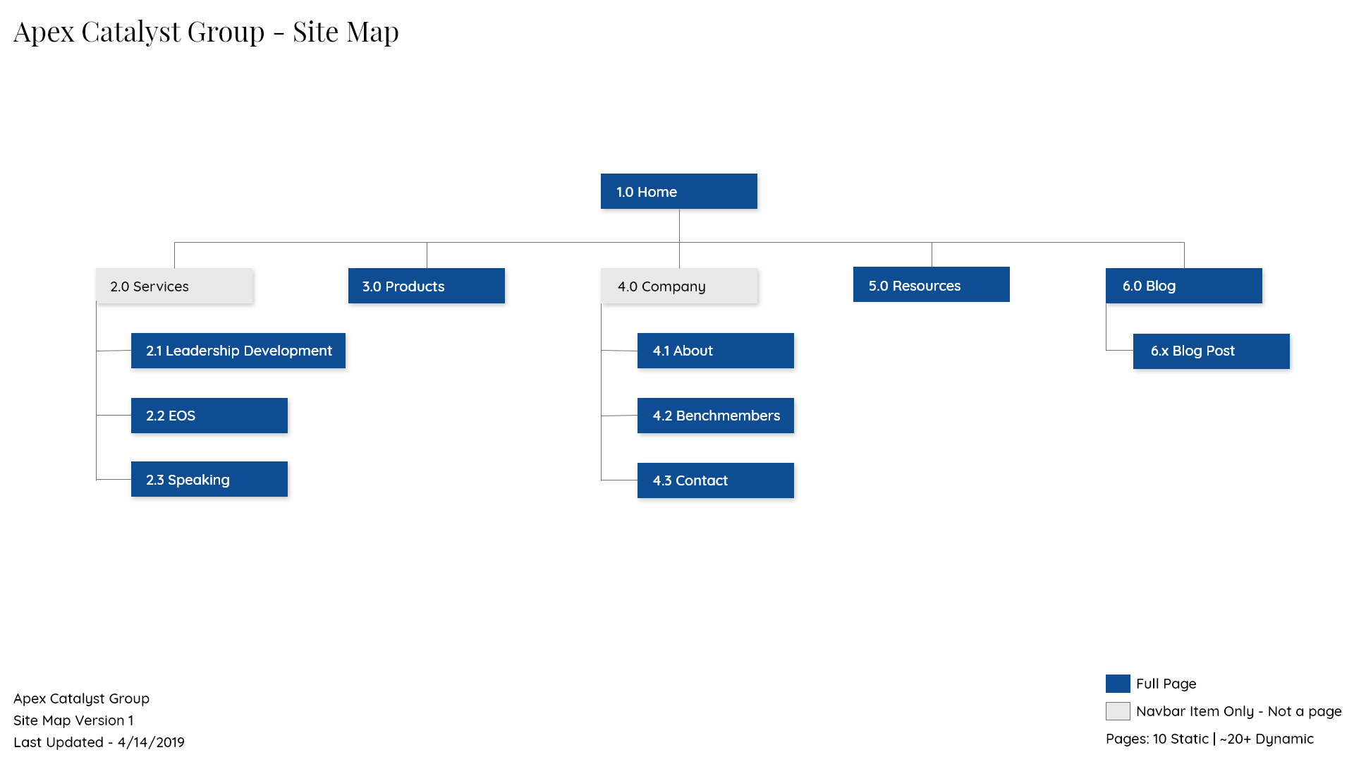
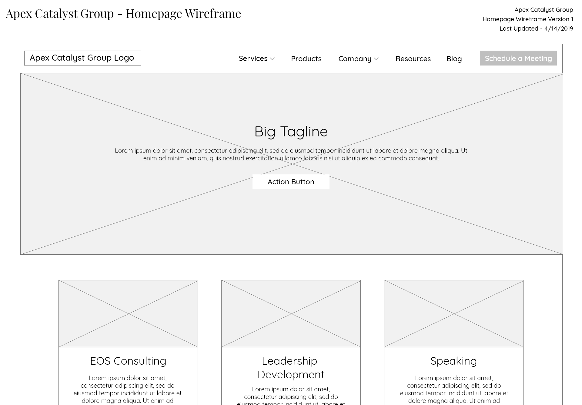
To get the ball rolling, I created the first version of the site map then designed some quick-and-dirty wireframes that used popular dummy elements found in company websites, like featured blog posts and clients. Sandi and her content writers were able to use this as a framework to start the content creation process.
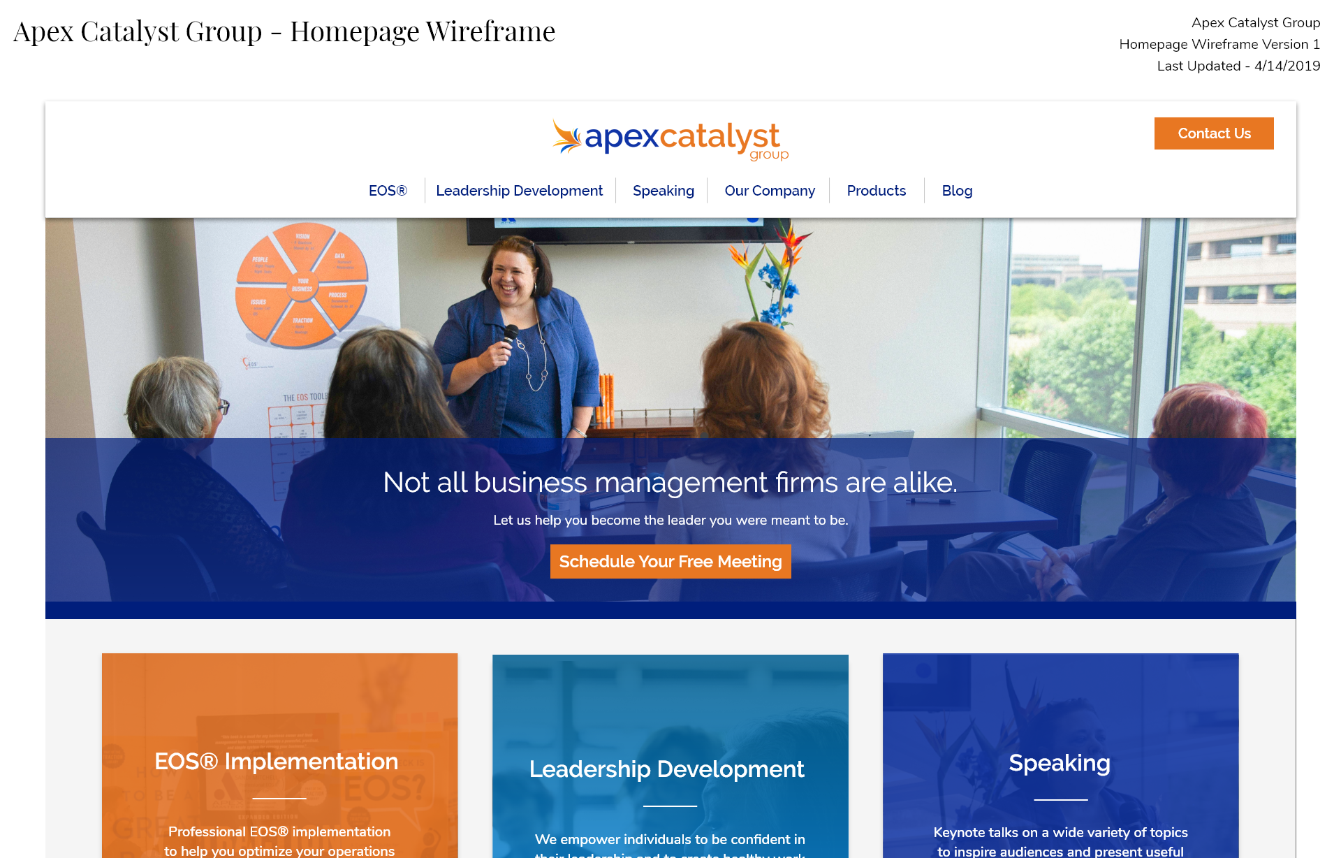
Once I had the first draft of content, I was able to flesh out the wireframes. I focused on layout and form, identifying areas where I could include visuals or icons to break up the text and create flow. The content writers and I bounced ideas back and forth to ensure the copy fit in well in a responsive web format. I also began visualizing a consistent design format that each page would follow.
Towards the end, I reconsidered how to do the navigation bar. I had learned that it’s generally better to keep the top navigation simple and short, so I had combined ACG’s three main services under a parent link named ‘Services’. However, I saw that some of ACG’s competitors split apart their services to have their own place in the top navigation. I thought this was a clever yet still simple way to immediately advertise the services of ACG to users and adapted the sitemap to follow a similar model.
Mock-up and Style Tile
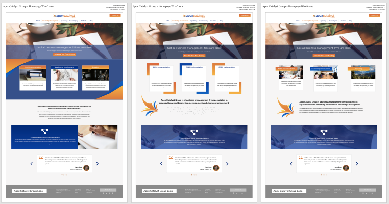
With the content and layout 90% of the way there, I started on the visual design of the website. I had already completed the logo at this point, so my main colors and fonts were already decided.
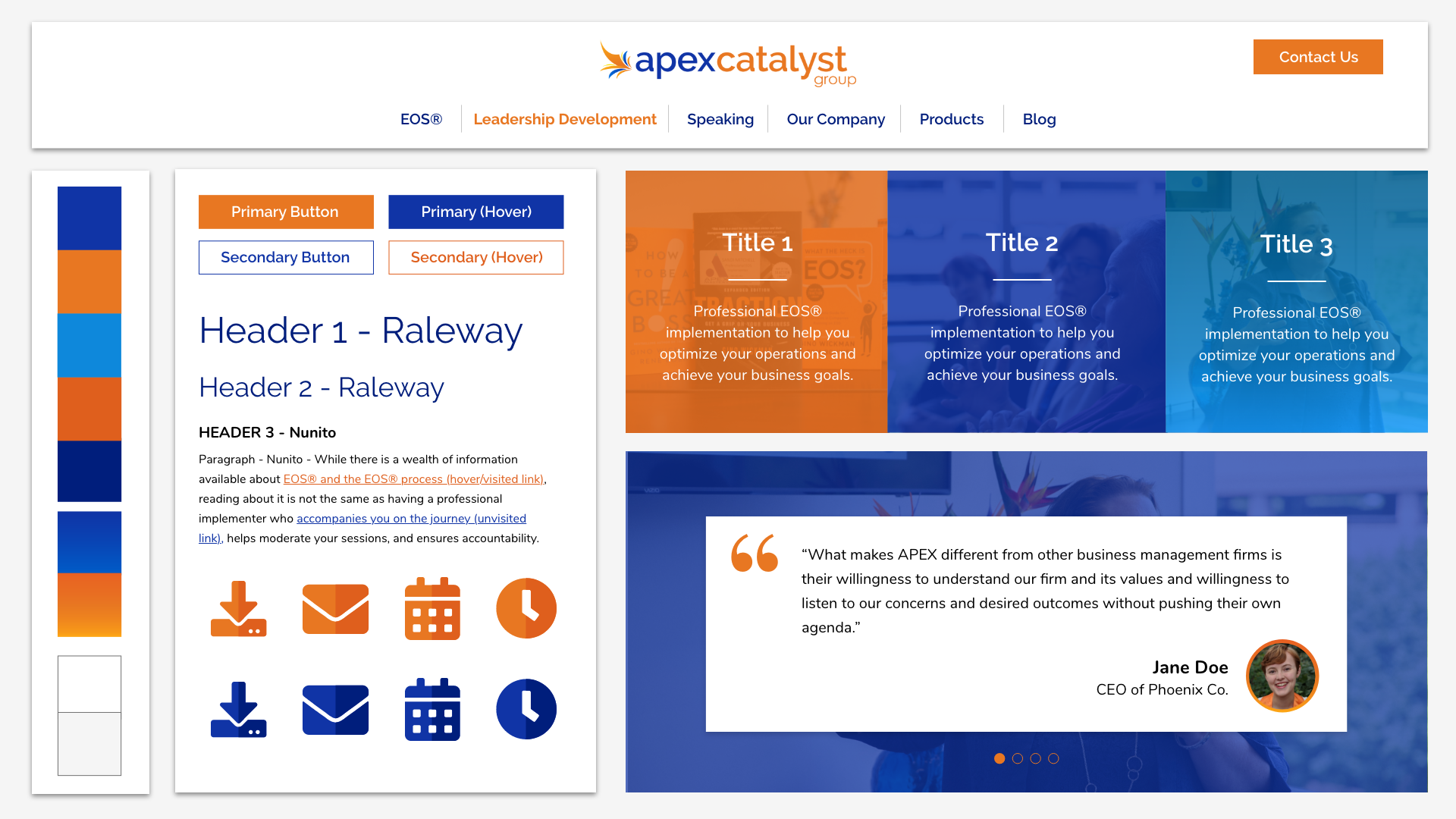
The plan was to only create a high-fidelity prototype of the homepage, since the remaining pages would follow the same design system. I would also build out a style tile – a mini design system document that illustrated the main colors, typography and components used in the website.
As usual for my design process, nothing seemed to work at first. I played with several different elements, like color overlays on pictures, fancy borders, and gradients galore. I ran into lots of contrast issues, and a lot of my ideas just weren’t visually pleasing.
I kept poking and prodding though, and eventually I came to a design both Sandi and I really liked. I popped in the company photos, developed the icon style, and made a last-minute change to the color scheme to improve readability. Now we were ready to actually make this vision happen!
Developing the Website in WordPress
My original plan for this project was to build a custom WordPress template from scratch. However, I realized that buying and customizing a pre-built template would make a lot more sense. It was cheaper to do for one, and since ACG’s website didn’t require a lot of custom functionality, it would speed up my development time significantly. It would also be easier for the client to maintain on their end. The Avada WordPress theme offered significant flexibility and customization that was perfect for the project, so I bought the license and got to work.
Most of the development was plopping in content and fine-tuning the CSS to match my design mock-up. There was nothing particularly tricky to develop, but I devoted a lot of time making small improvements here and there, like adding subtle animations, optimizing images, or ensuring it still looked great at all screen sizes. I’m quite happy with the final result.
You can view the final website here, at www.apexcatalystgroup.com.
Objective #3
Create a branding media package that evokes ACG’s brand across their customer touchpoints.
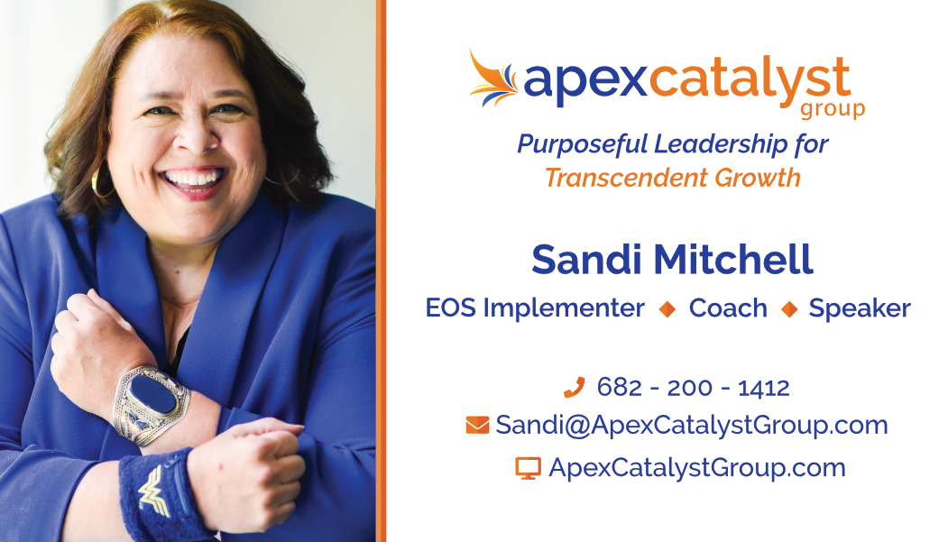
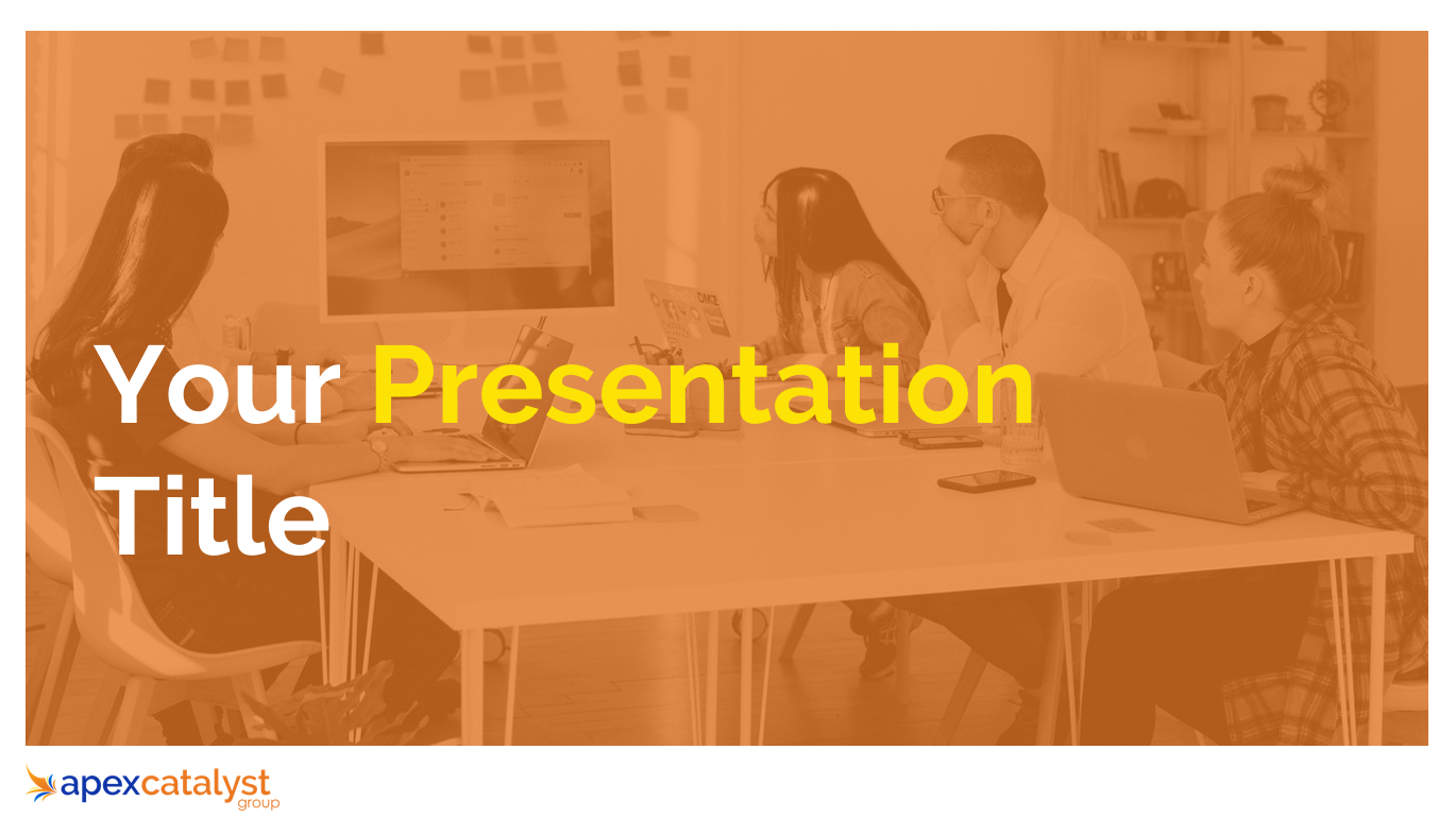
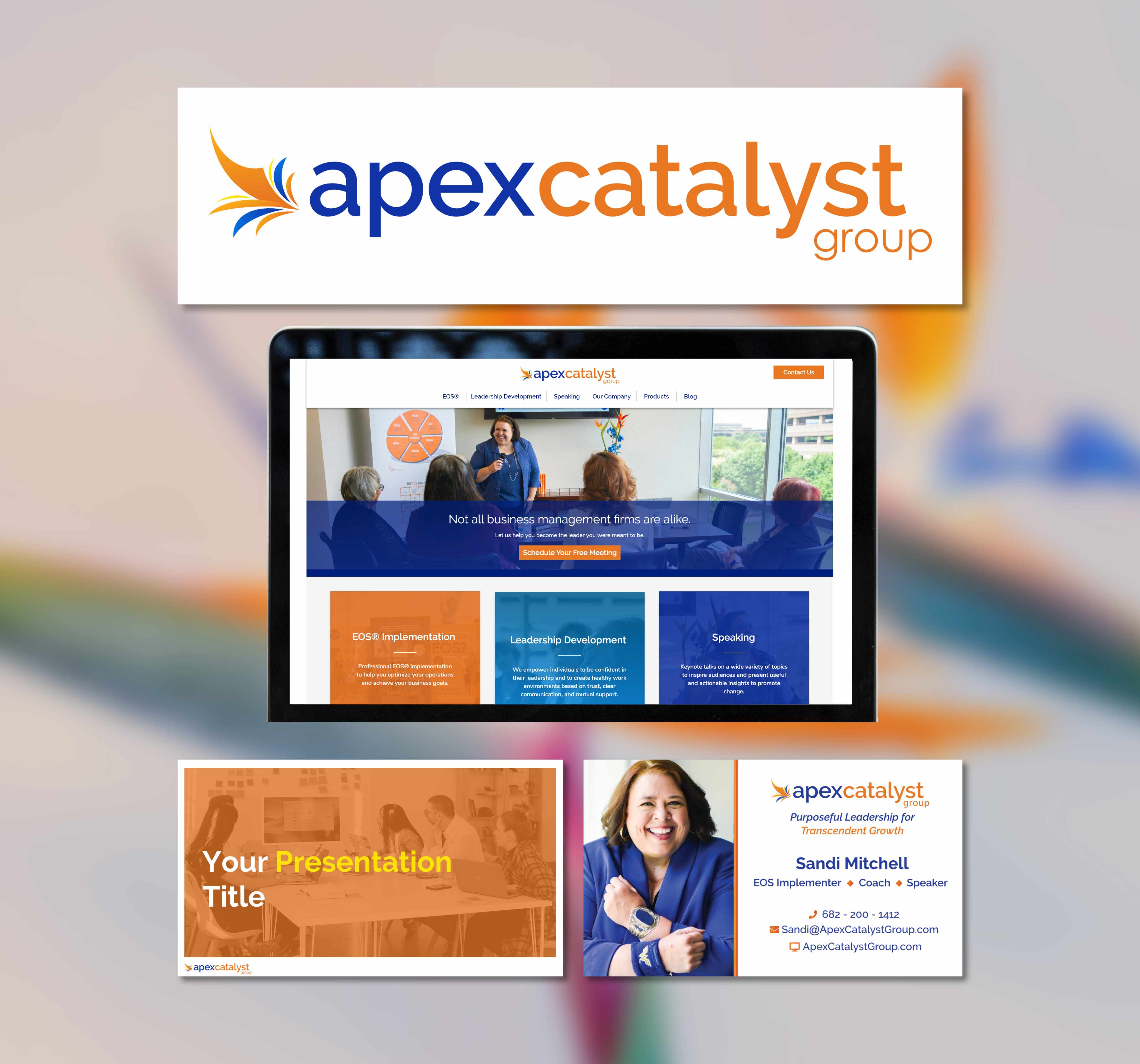
A brand doesn’t stop at a logo. There are dozens of touchpoints that can be used to promote a connection between customers and a brand, from digital touchpoints like social media and presentations to physical items like personalized notecards and business cards.
For the last portion of the project, I took the design style I had developed with the logo and website and spread that across several brand touchpoints. Here are some of the items are worked on.
Reflection
This project was my first venture into work outside of college. When I started, I wanted to start a freelancing company for design work, and this was a great project to start building my portfolio and network. Sandi really is a superhero, and I was excited for the opportunity to help expand her company that she built from scratch.
Designing the logo was an exciting prospect for me, since my work would be the face of the company. Visual design doesn’t come easily to me, so I was a bit apprehensive as well, especially since I was constantly hitting roadblocks for the first few weeks. I am extremely pleased with my final result, however, which came about from weeks of iteration, brainstorming, and feedback.
I was much more comfortable with the website, since frontend design/development is my specialty. It was an interesting opportunity to refine a process and tech stack that optimized development time, flexibility, and maintenance expectations. I learned a lot about working with clients, like managing expectations, simplifying mock-ups to focus on what’s important, and inevitably pivoting when a new requirement popped up.
The branding media package was also a fun exercise in visual design. It was less pressure to work on this since I had already done the hard work of defining the brand style with the logo and website. I hadn’t worked much with print design before, so it was informative to learn about using the right paper sizes and color profiles.
I eventually decided that freelancing wasn’t for me at this point in my life – not because of anything wrong with this project, but because I realized that I was much happier and more productive with a structured job. I also realized that while I had a business mind, I didn’t have a business heart. I had a tendency to do free work out of a desire to help, and I’ve never been one to easily promote myself and my work.
All in all, I’m glad for the opportunity to flex my design and business skills, and I’m excited that I got to create all of this for someone who is very important to me and who I admire a great deal.
